HOWSEE好望
Visual Identity Design for an All-Female Ceramic Education & Residency Studio
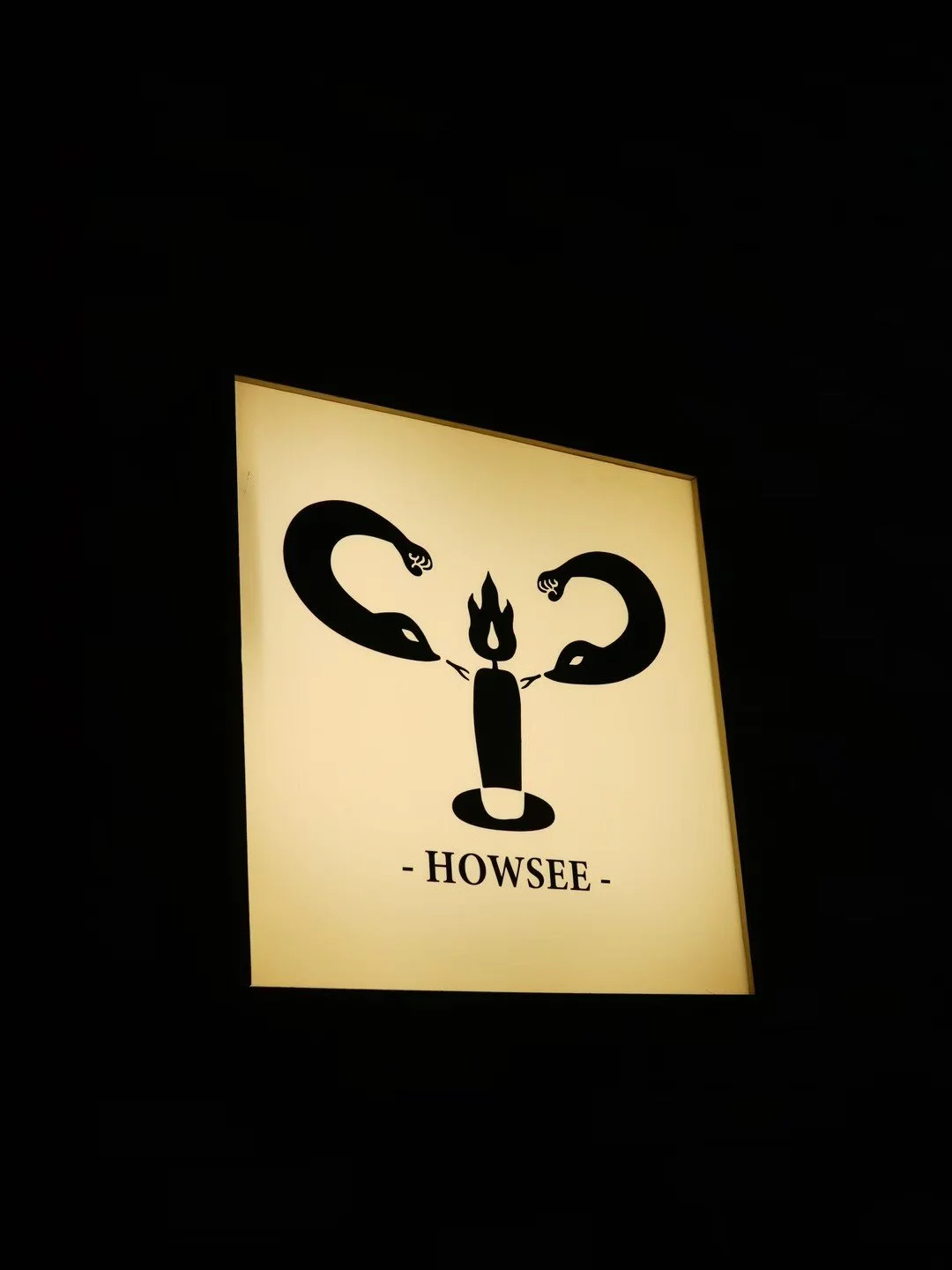
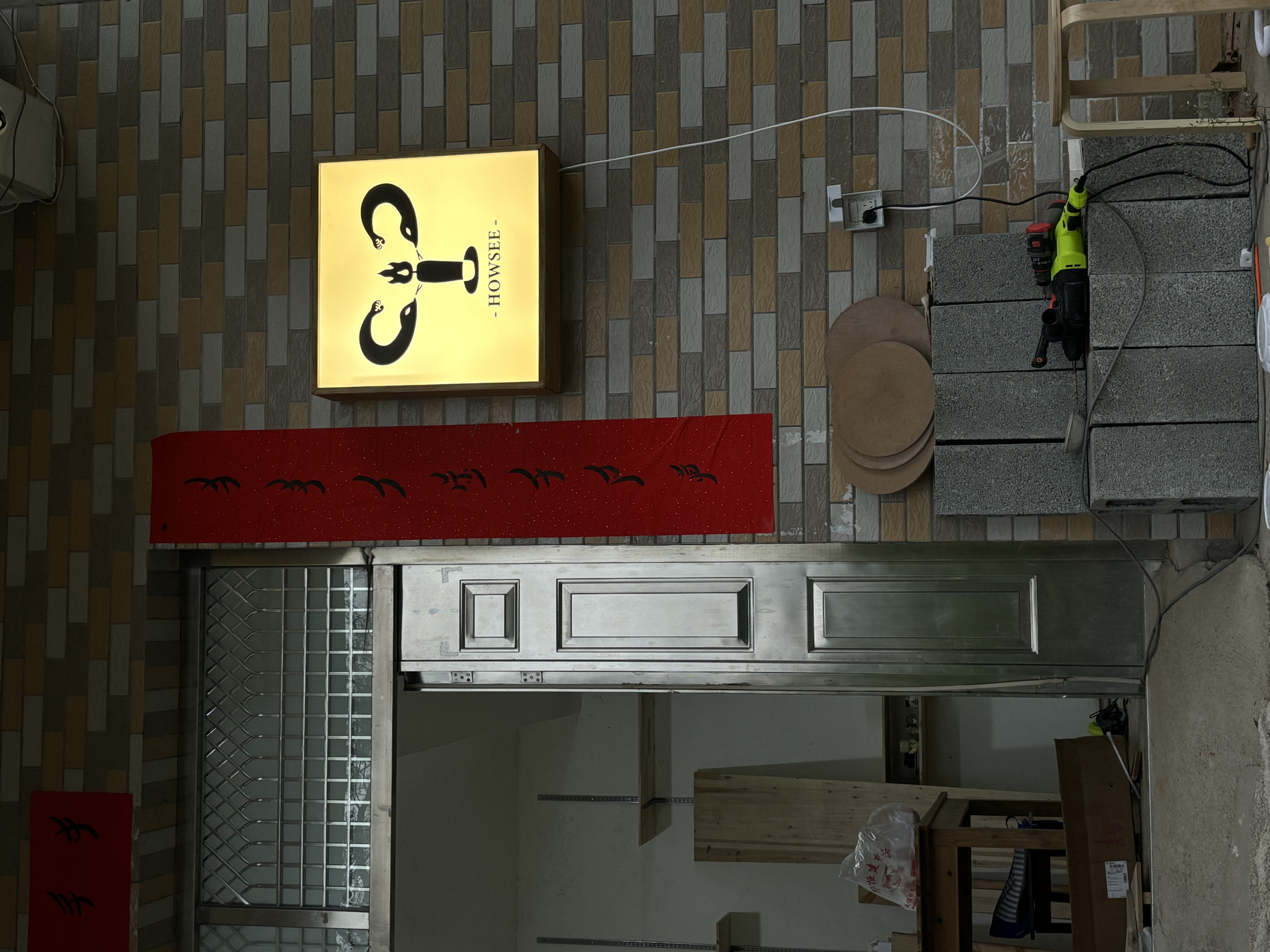
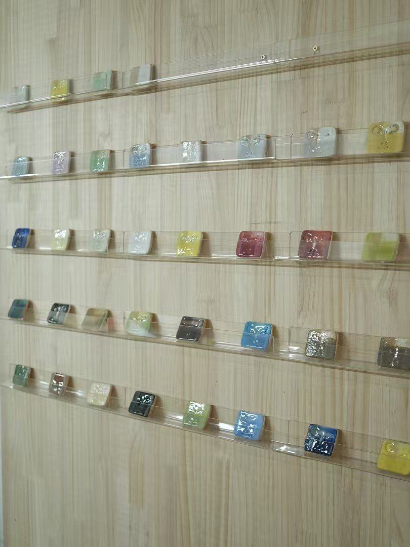
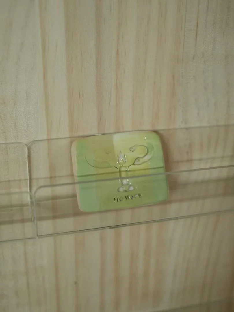
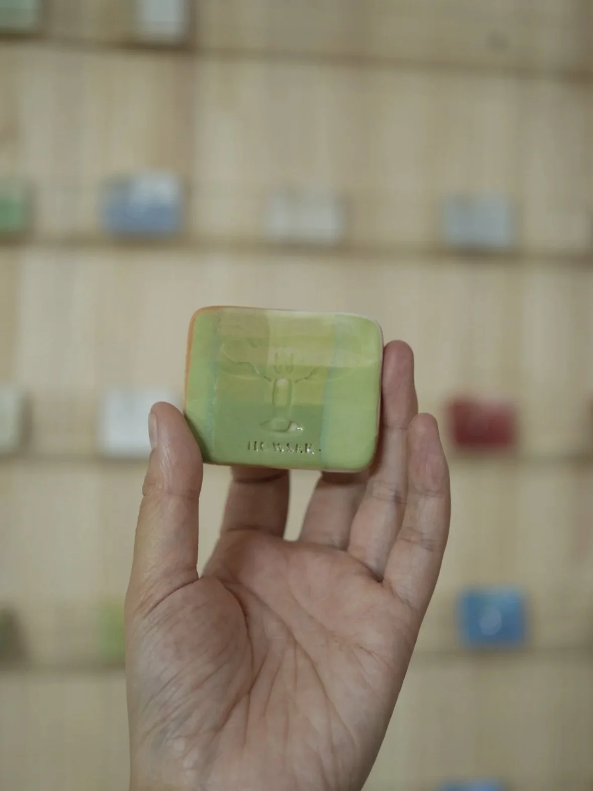
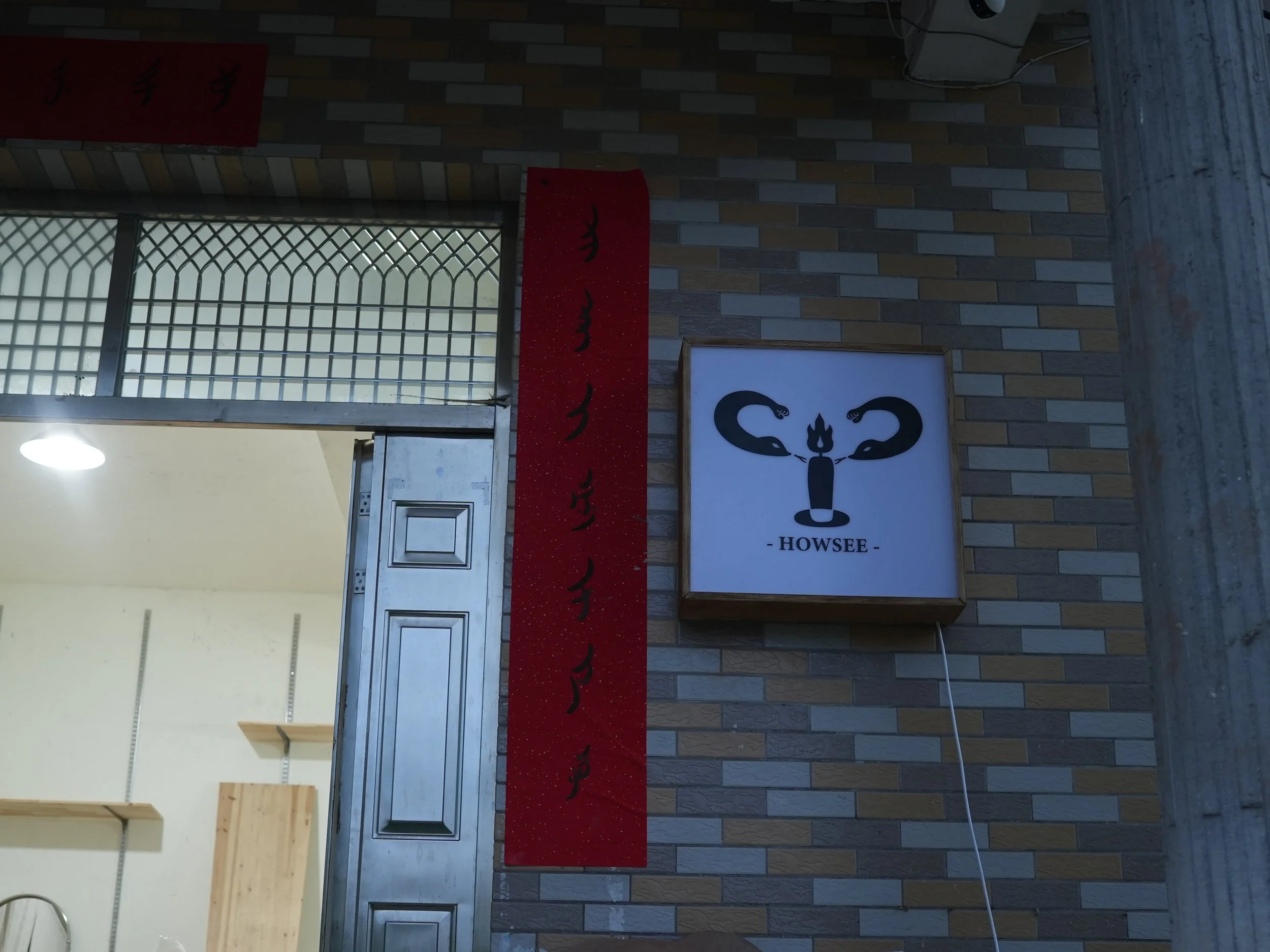
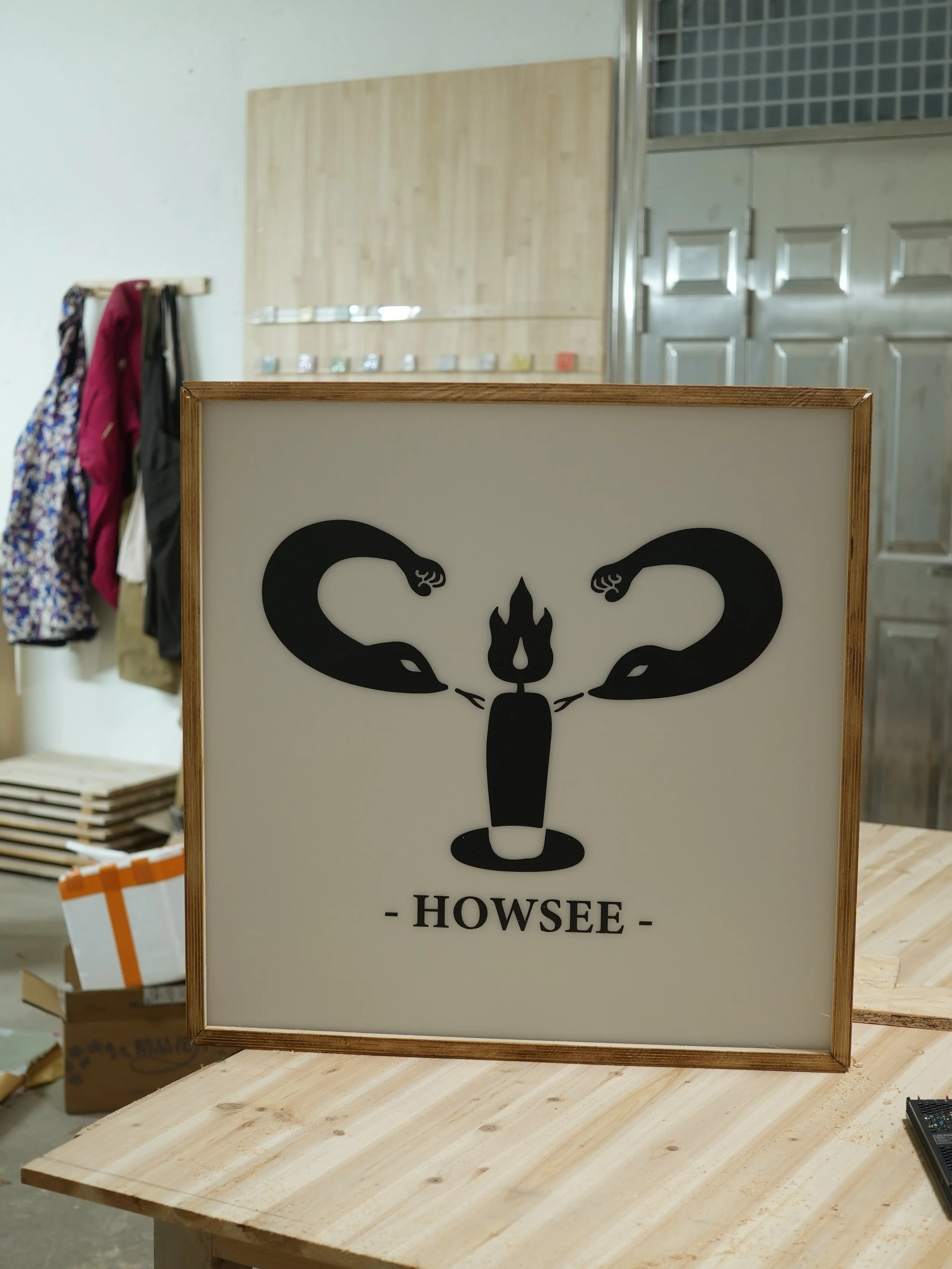
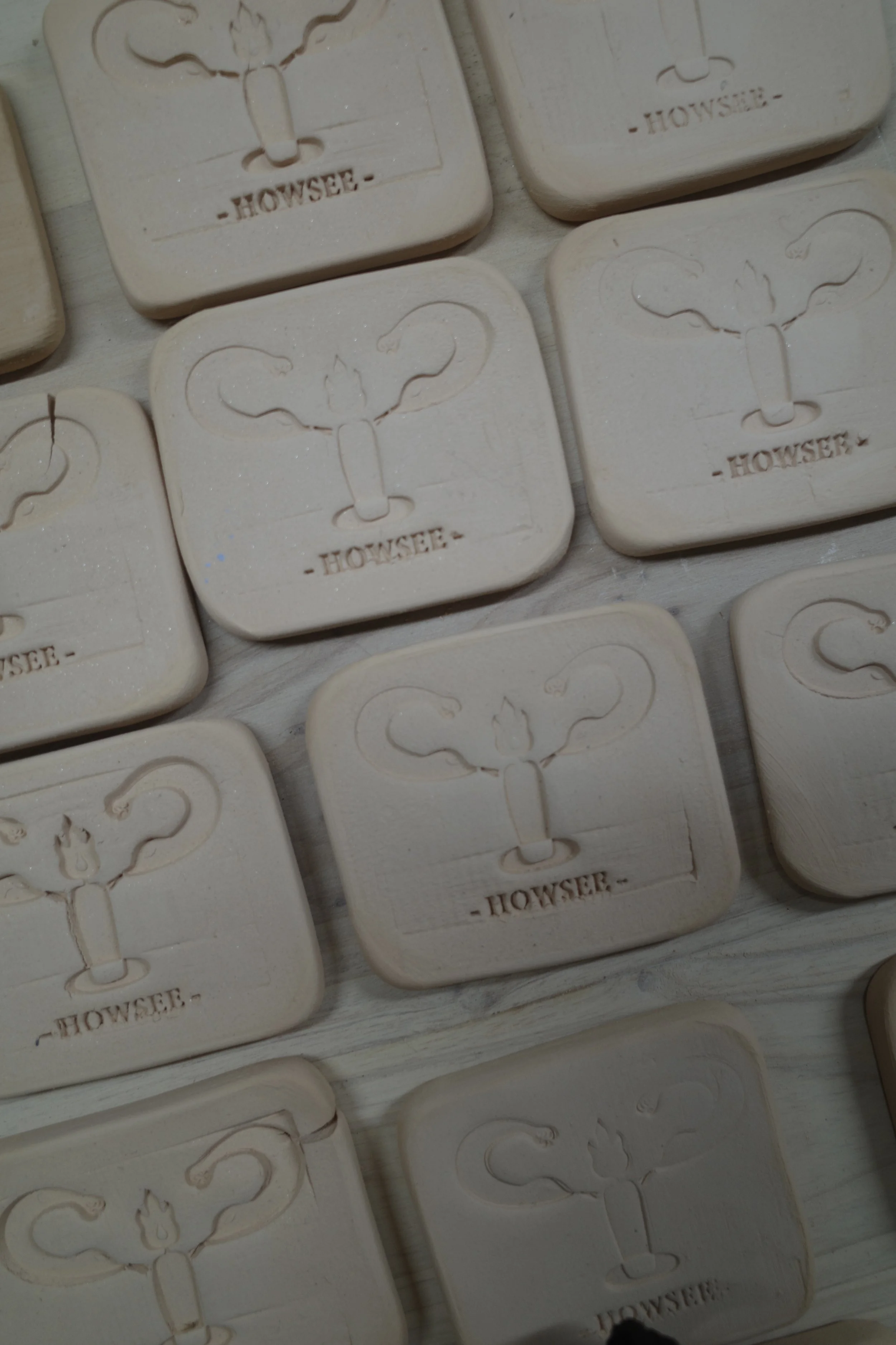
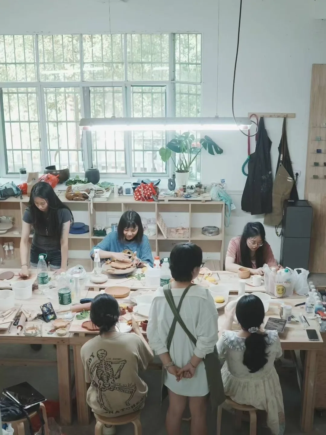
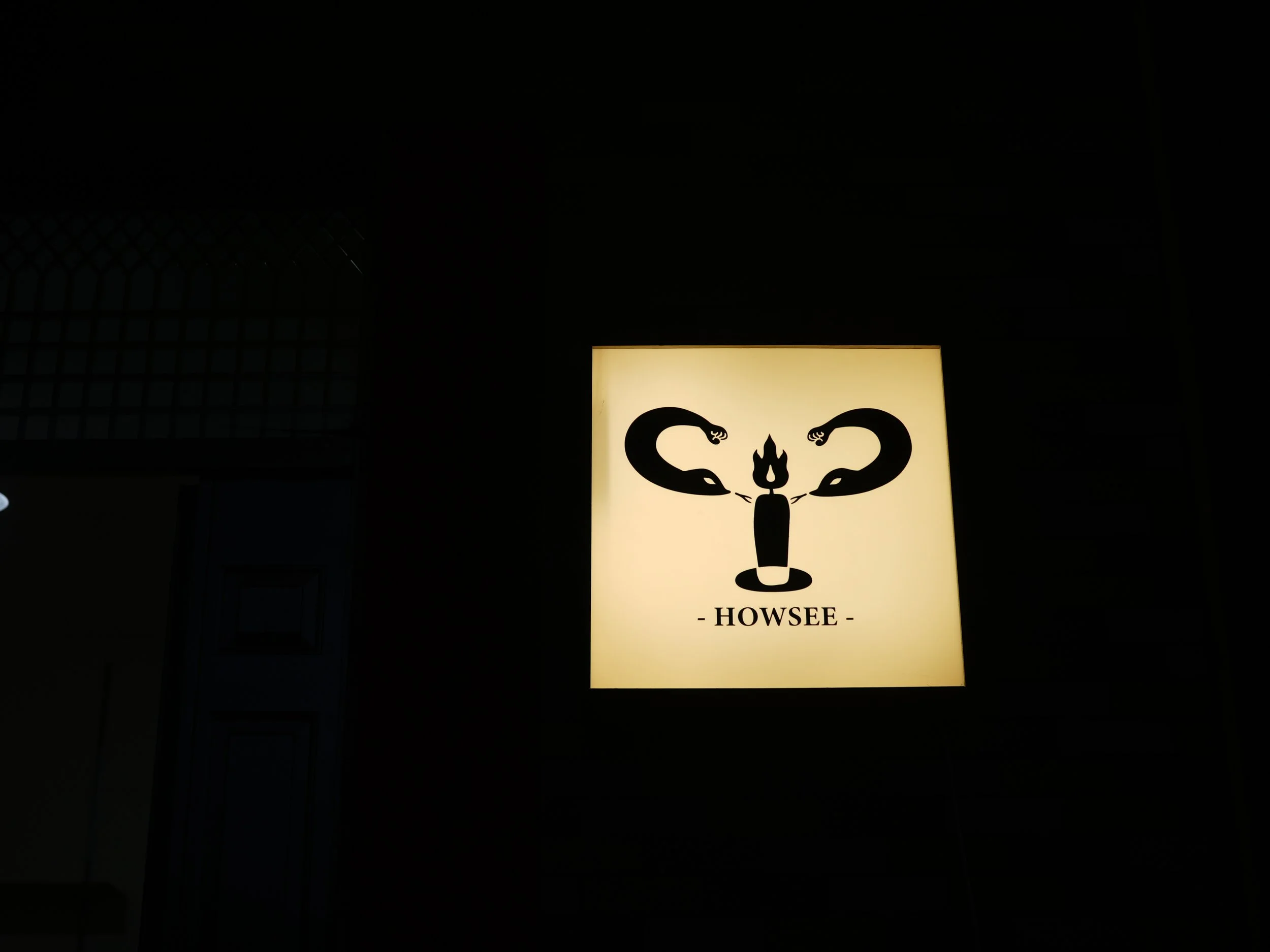
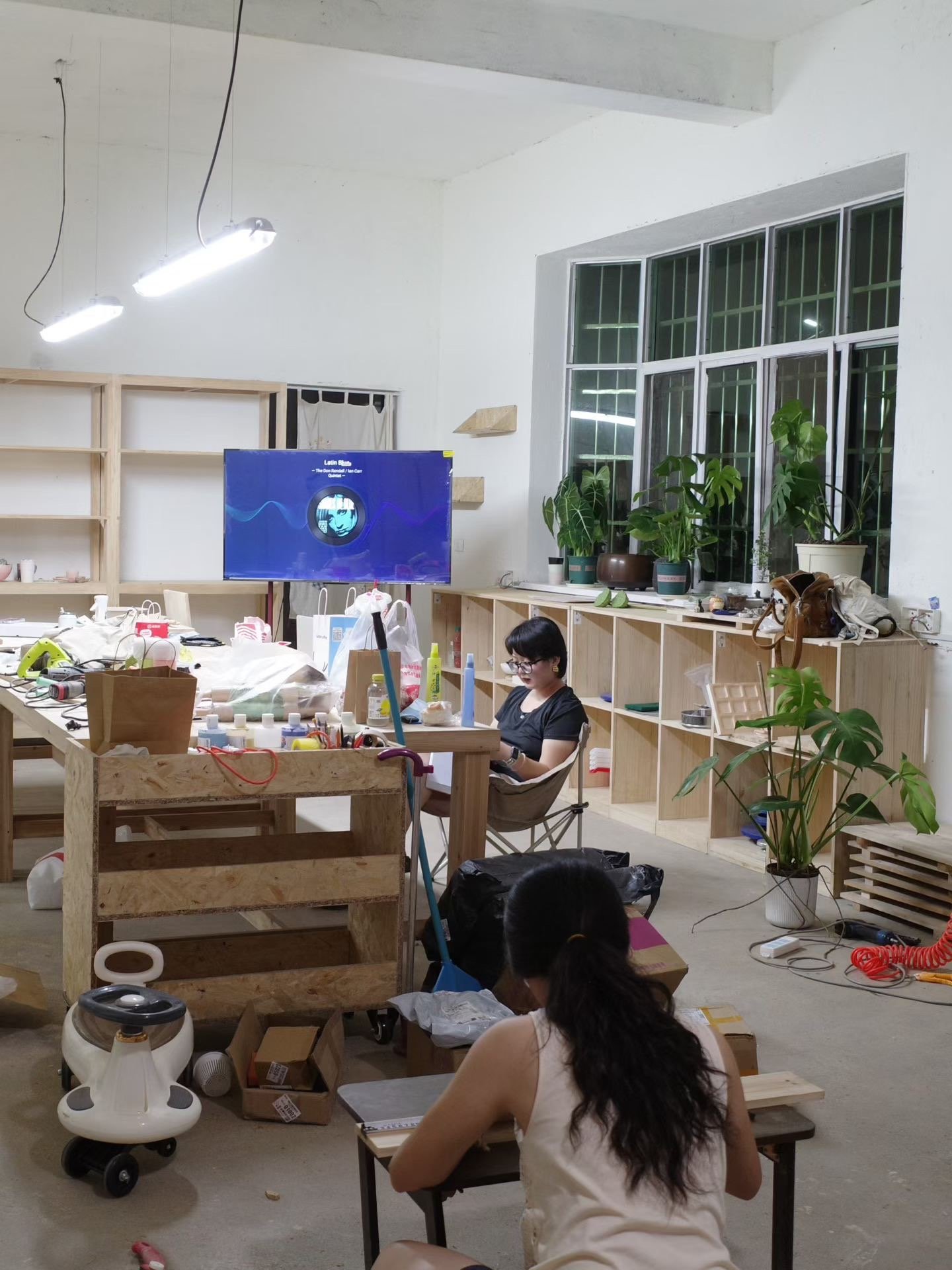
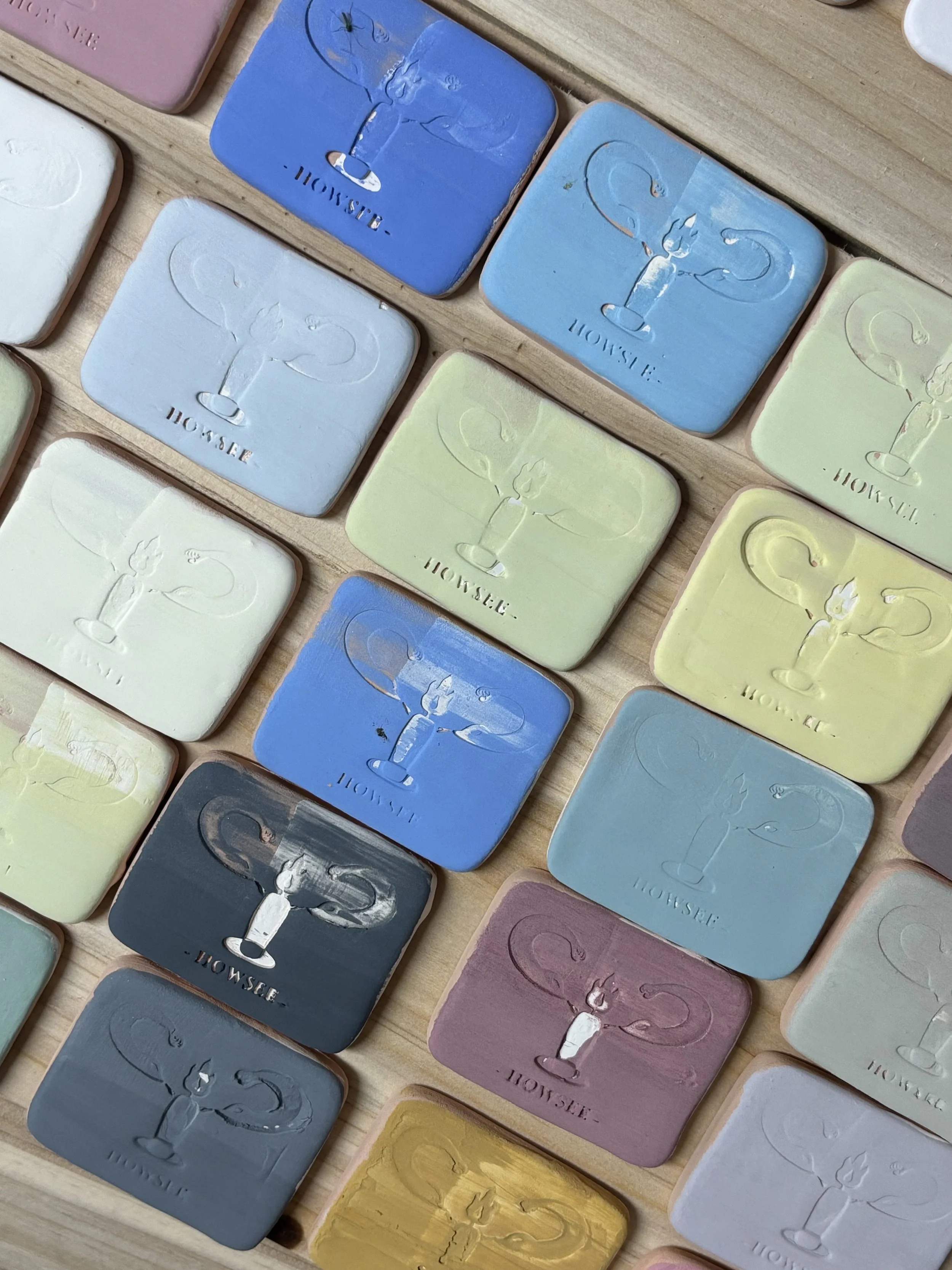
Howsee 好望 is a women-only ceramic education and residency studio for which I developed a complete visual identity. The logo incorporates a candle as a symbol of light and hope, alongside two snakes referencing female strength and collective power.
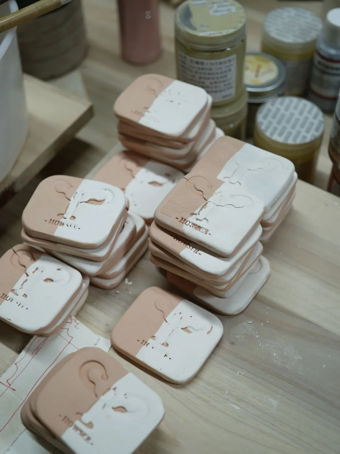
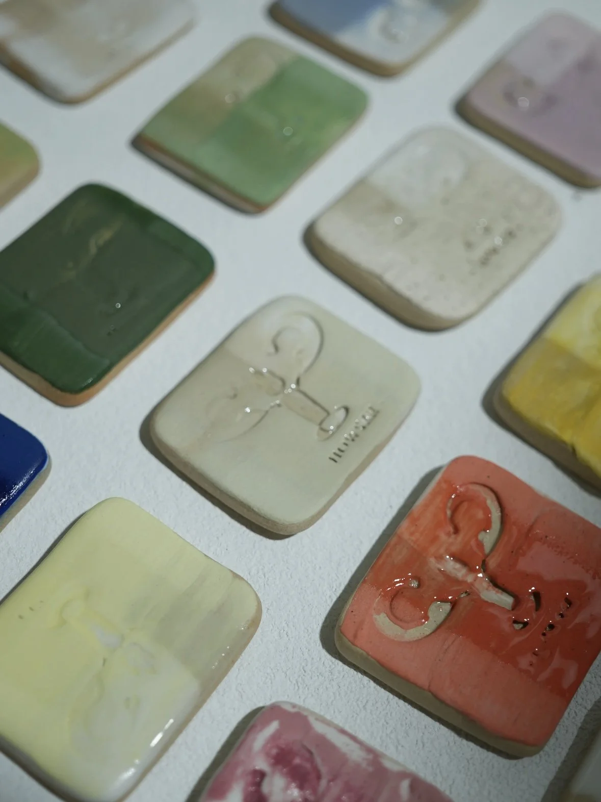
In addition to the visual identity, I shaped the brand positioning and marketing strategy, ensuring consistent communication across spatial design, social media presence, and promotional campaigns—including an exterior lightbox sign, ceramic test tiles produced using logo-embossed moulds, interior spatial planning, and the studio’s Xiaohongshu (Little Red Note) content and visual materials.
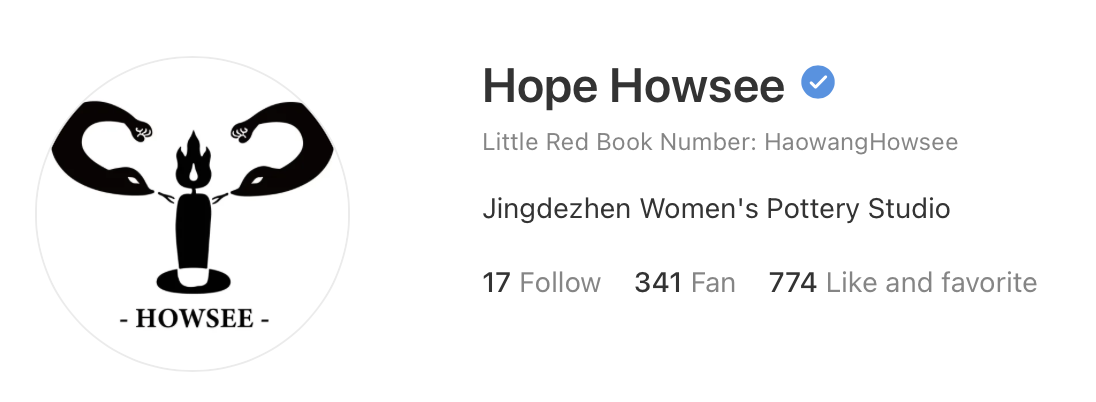
click the image to explore their xiaohongshu (Little Red Book) page